Design Samples
Responsive Design
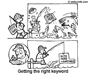
What is Responsive Design?
Websites using responsive design automatically make allowances for the changing screen resolution and size used to view a Website. The rapid growth of Smartphones and tablet users dictates that your Website be accessible from all media types. Responsive design accomplishes this effortlessly. — This Website uses responsive design. You can test this by changing the size of your Web browser to see the sections move below one another for continuously viewing. No more scrolling from side to side to view the complete screen.
Reasons why your Website should be Responsive.
- 4 out of 5 customers use mobile phones to shop. 70% of mobile searches result in action within 1 hour.
- Todays' clients are shopping from their mobile devises.
- Make sure all your visitors have access to the same information and features no matter what screen size they are using.
- Google has taken a strong stance on mobile SEO, Google announced that there will be demotions if your site is not mobile friendly.
Compare a Standard Website to the Responsive Website below.
 |
| Responsive Website Smartphone Portrait view 320 X 480 |
Responsive Website
(Images not to scale)
 |
| Full screen Desktop view 1600 X 1200 |
 |
| Non-Responsive Website Smartphone Portrait view 320 X 480 |
Standard Website
(Images not to scale)
 |
| Non-Responsive Website Full screen Desktop view 1600 X 1200 |
The following screen shots display the amount of the information that can be displayed on a screen when a Website has been created as a Responsive design.
 |
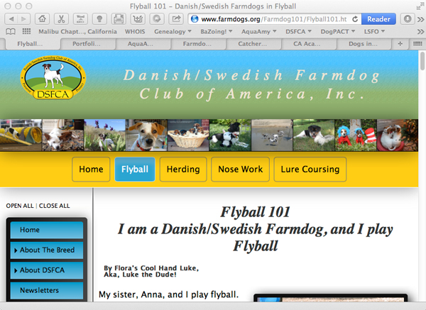
| Full screen 15" Laptop view 1440 X 900 |
 |
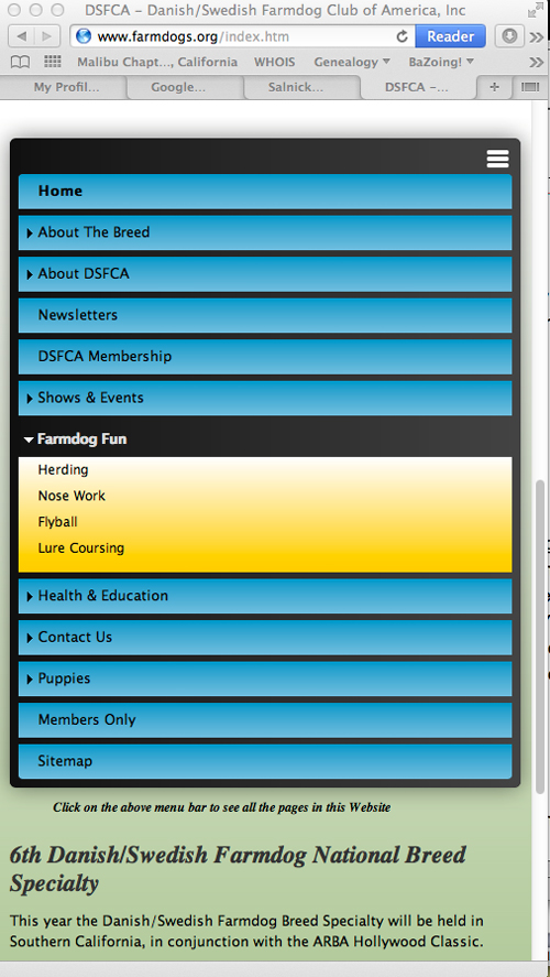
| Tablet Portrait view 780 X 1024 |
 |
| Tablet Landscape view 1024 X 780 |
 |
| Smartphone Portrait view 320 X 480 |
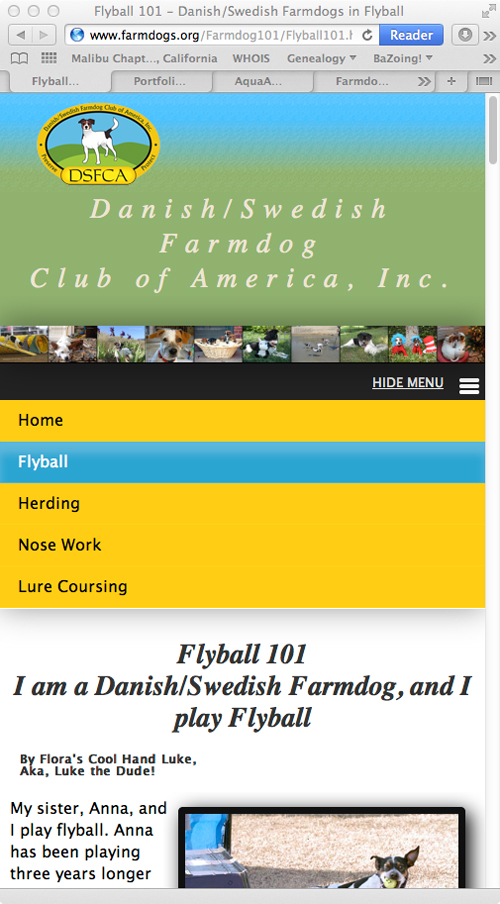 |
Smartphone Portrait view |
 |
Smartphone Portrait view |
 |
| Smartphone Landscape view 480 X 320 |
Note: The images are not to scale. They are only to display how the information is sized to fit the various screen sizes and orentation.
When the Web browsers detects the user is viewing the Website from a Smartphone or tablet it automatically stacks the sections and reduces the image size to fit the device screen size. It accounts for both landscape and portrait views. Keeping this concept in mind the Web designer should create each Web page so that the flow of content is consistent on all screen sizes. What looks good on a desktop may not flow in the same pattern on a Smartphone or a Tablet.
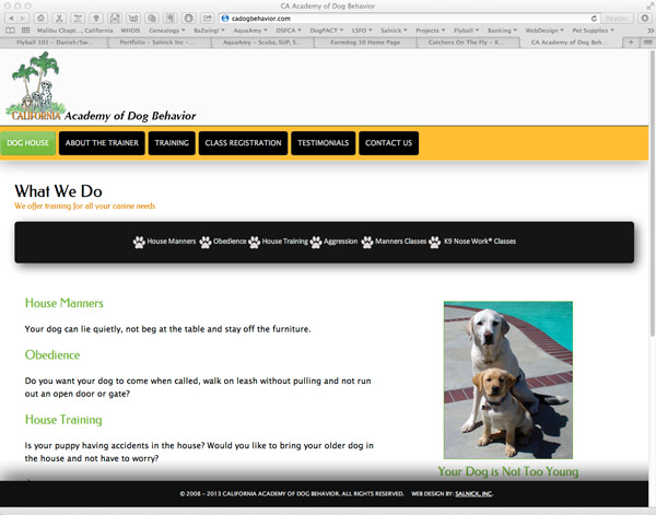 |
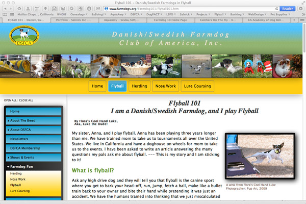
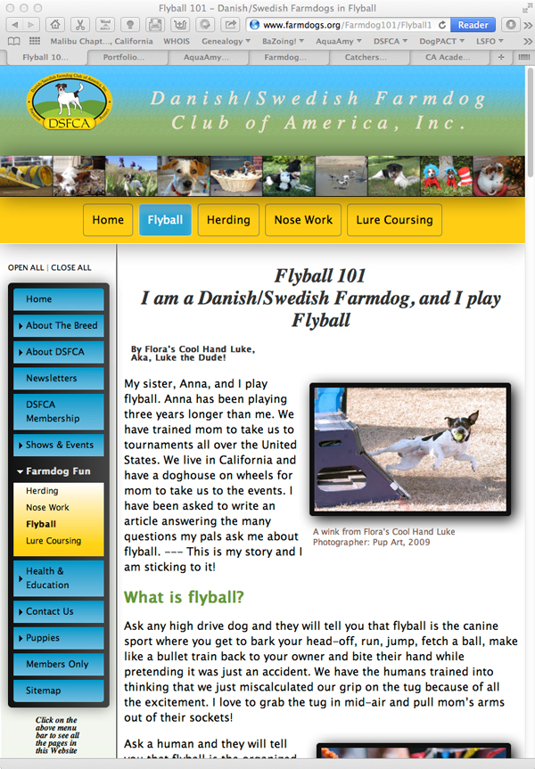
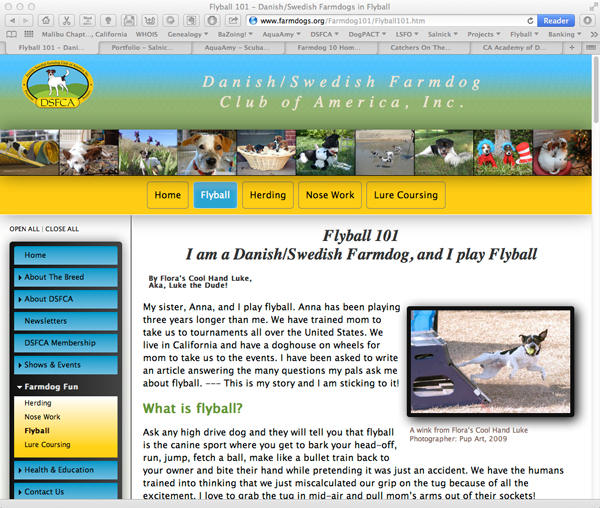
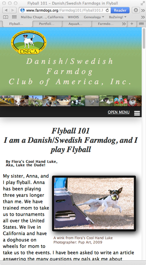
California Academy of Dog Behavior is a Single-Page Website. Once it was converted over to a Responsive Website you could no longer scroll down through the page sections. The links make it apear as a Website with six separate pages. |
Static Web Design
Static Web pages are very commonly used for informational Websites. They present the same information to all viewers. Static Websites pass information from the server through the Internet to the viewer's screen. There is no interatcion between the viewer and the Web server. — Think of them as news papers or magazines.
Site Type: Static
Informational Website
Designed: 2013
Maintained by: Salnick, Inc.
Active Link: catchersonthefly.org
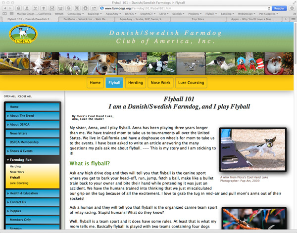
This site was designed for a K9 Flyball club. It consistes of static public information about the dogs and team racing statistics.
Features
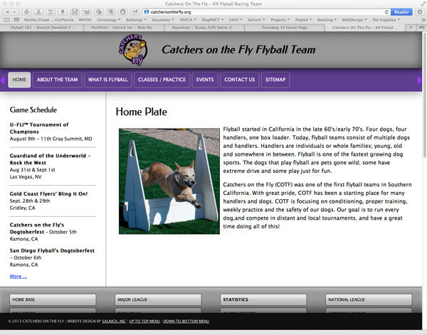 |
Catchers on The Fly Flyball Team |
Responsive Columns
Each row you create can be set to various configurations of between 1 and 5 columns.
Row 2 when stacked:
Columns can display divider lines between colums and on top, botton or both. Both columns in this row are set to be equal heights.
The columns will automatically stack when viewing on a Smartphone
Row 3 when stacked:
You can see this on the following Websites:
www.catchersonthefly.org
www.farmdog10.com
www.cadogbehavior.com
www.farmdogs.org
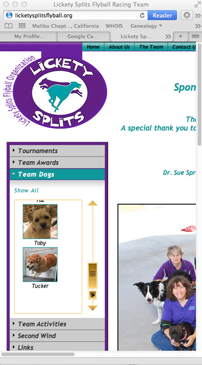
Accordian Panels
On the Catchers on the Fly Website Accordian Panels are used for quick links to information about the team. When you click on the menu item the panel drops down to reveal the contents. Clicking on the panel tab will close the panel and open another. This panel is set to show only one panel at a time.
Tab Panels
Click on dog's picture to move from palen to panel


Tree Menu
Image Rotator

- Mindeaspine
Mindeaspine.com
Website no longer active - Aquaamy
www.aquaamy.com
Active Website upgraded to be a Responsive Website in 2013 - BackInMotion
www.backinmotioninc.com
Active Website last upgrade 2010 - DogPACT
www.dogpact.com
Active Website never upgraded, content kept curent - DSFCA
www.farmdogs.org
Active Website upgraded to be a Responsive Website in 2013
Video
Dynamic Web Design
A dynamic Website has page content that varies based upon the parameters provided by the user or a computer program. Examples of dynamic content are shopping carts, club members sites, blogs, keyosk/ATM machines, forms and other information gathering utilities. The flow of information back and forth between the user and the server is what makes the content dynamic. The user requests an item —> the server asks for details —> the user gives spcifics —> the sever researches a database based upon the users reply; processes the information and then presents the user with and answer. The content can be different for each user.
Some examples of dynamic Website are shown below:
Members Only Websites
Club Website are usually database driven and may or may not require users to login before viewing the Web content. This club Websites resides on the ClubExpress Web servers and are restricted by the use of the ClubExpress template software.
 |
Danish/Swedish Farmdog Club of America, Inc. |
Shopping Cart Websites
Shopping Carts can be for several products as well as a few. They can process payments through an online merchant account or a simple PayPal account.
Shopping Cart Software
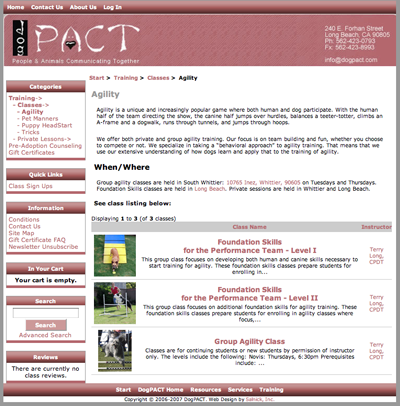 |
DogPACT.com |
Shopping Cart Design
Shopping Carts can be for several products as well as a few. They can process payments through an online merchant account or a simple PayPal account. Below are some examples of the various kinds of shopping carts.
Online Forms
Most of my clients are switching over to Wufoo and Jot Forms because of the simple record keeping, fast payment methods and email notifications of orders placed.
Customers can fill out the form and pay for it with their credit card or their PayPal account. Below is a sample of a class registration form that uses Wufoo Forms.
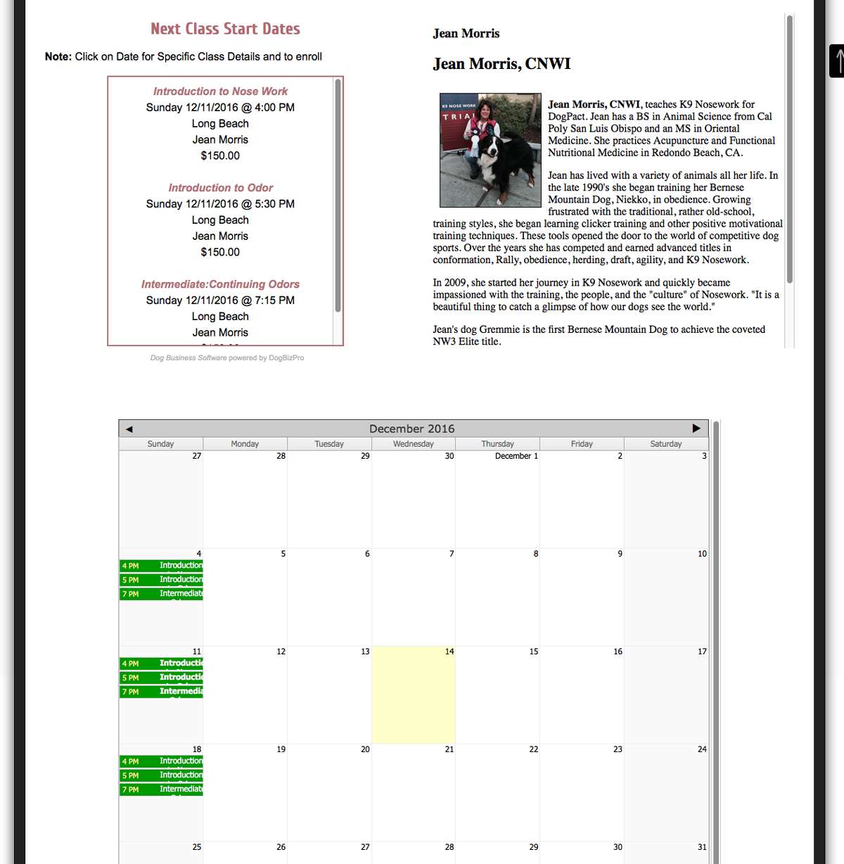
Class Registration Using DogBizPro
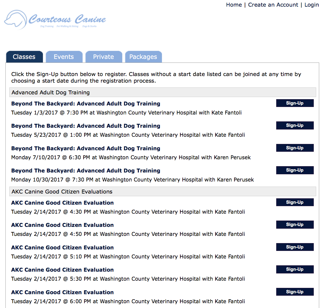
Class Detail Page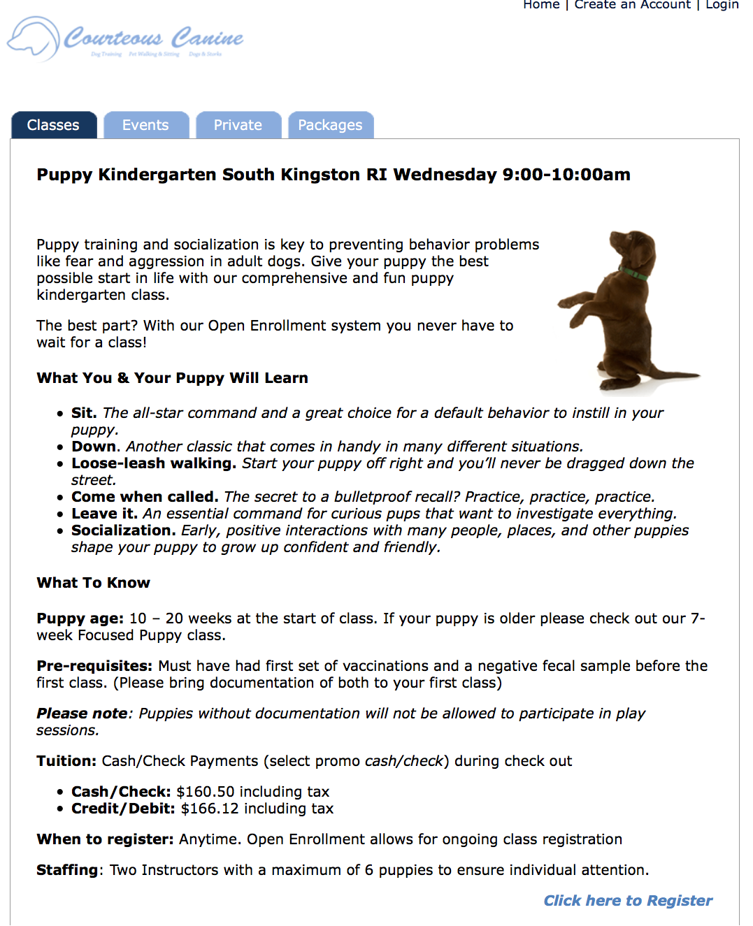
Each class has a detailed page with a Registration Link at the bottom
This client uses Dog Biz Pro for a limited amount of classes. They use the software to keep detailed records of their clients and dogs. Only the classes are listed. All private training is viewed by their instructors through the admin module.

Each public class Webpage displayes the current class list and instructor information. Classes can be displayed in list format and a calendar view. Clicking on the class will take you to the Dog Biz Pro Registration form.
Dive Tours using FareHarbor
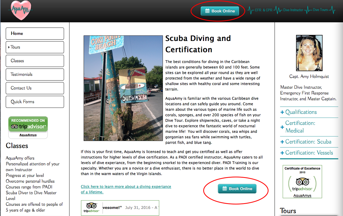 AquaAmy uses FareHarbor booking software on her Website. Her clients can book Dive Tours through their Hotel, Cellphone, or as a walk-up client on the beach. Tours are booked and paid in full leaving Captain Amy to do what she does best, dive instruction and certification.
Book by Activity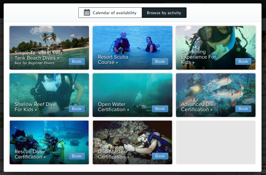
Once a client clicks on the Book Online button they are taken to either the Book by activity Page or the Book by Calendar page.
AquaAmy's clients can plan their water activities while planning their vacation.
Book by Calendar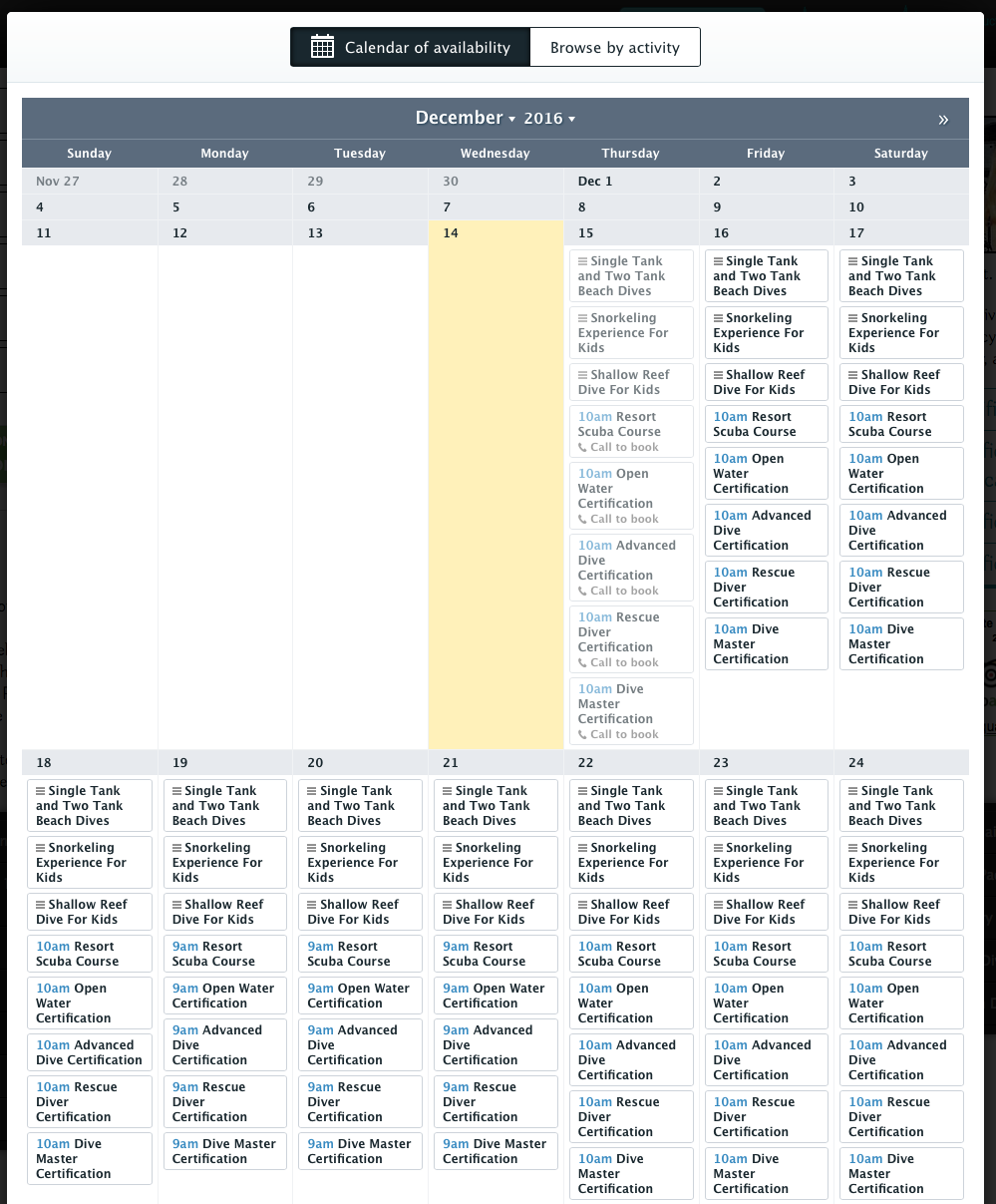
PayPal is an easy way to add payment buttons to your Website. Below are just a few samples